What is your favorite font?
It better not be a system default.
Published Nov 14, 2024 · Around 2 minutes to read
12 years ago, I was interviewing for my first UX job. I made it to the last round: an interview panel with the design team. It went so well that by the end, we all relaxed and started talking shop. We discussed the hottest data visualization trends and typography. Then one of the designers casually asked me what my favorite font was.
I said Myriad Pro.
The designers simply nodded. My answer deflated the friendly atmosphere, and our chat was hurriedly concluded.
I realized later what a blunder of an answer that was. Myriad Pro (at the time) was the default font in Adobe Photoshop and Illustrator. And it was the only font I had used in all of my graphic work. I was changing my career path from architecture to UX, so my focus until that point had been on technical diagrams, 3D illustrations, and data visualization. Typography was an afterthought. But for a designer looking to get paid, Myriad Pro screams amateur.
A designer saying Myriad Pro is their favorite font is like a photographer saying their favorite camera is their phone's camera app.
I didn't get the job. I'm pretty sure it was because of my complete lack of typographic sophistication - and that's a valid reason. The way a designer speaks about typeface (or any other part of design) reveals their depth of craft knowledge. More importantly, it reveals how passionate they are about their craft.
Thankfully, the Creative Director who interviewed me was chill and helped me get my foot in the door at another company. Funnily enough, this Director was obsessed with typography and infected everyone around them with enthusiasm for craft.
I try to emulate that same kindness and passion for craft.
—
P.S. A font is a subset of a typeface. So “Calibri” is a typeface and “Calibri Bold” is a font (variation) within that typeface. I said font instead of typeface above because it’s more relatable for non-designers.
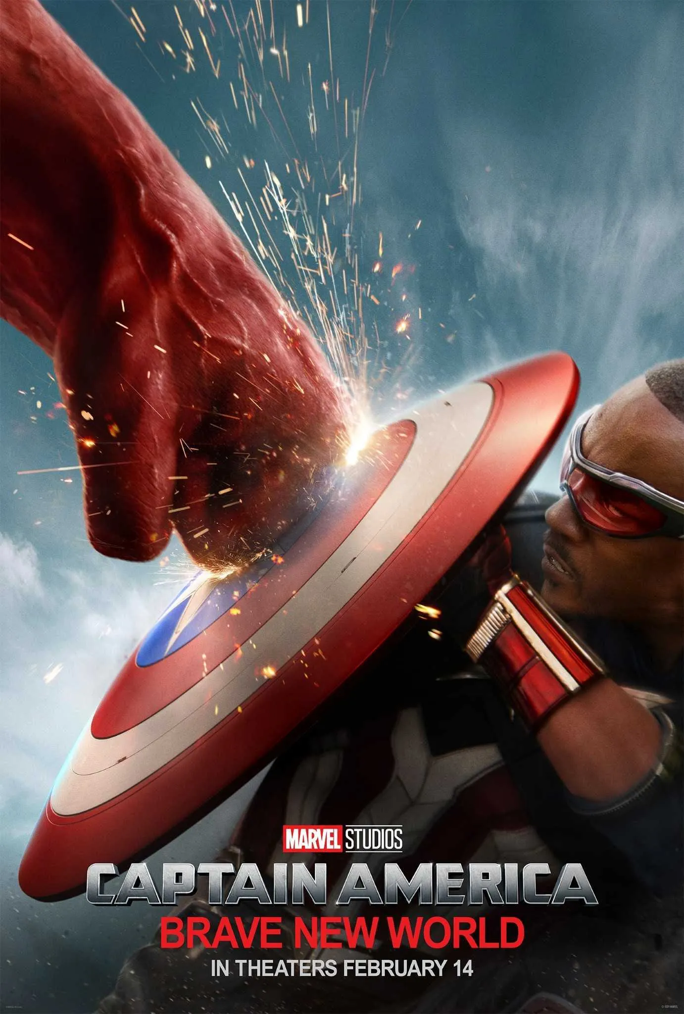
P.P.S. I remembered this anecdote after seeing this new Marvel movie poster. The “Brave New World” tagline looks like a default typeface. Is that Arial?! It feels like SNL Papyrus part 3.

READ NEXT
