
Hand-painted branding.
Imperfection is refreshing.
Published Sep 22, 2025 · Around 2 minutes to read
I grew up in Abu Dhabi, and I spent my summer breaks in India. On the ride from the airport to my grandparents' house, what stood out most to me (besides the noise and insane traffic) were the hand-drawn visuals:
Bollywood movie murals, truck and rickshaw art (Horn OK Please), Kolam chalk drawings in front of houses, hand-lettered shop signs, and political graffiti and ads (in Engrish).
I didn’t care much for it then. But I miss it now. AI imagery has made me extremely weary.
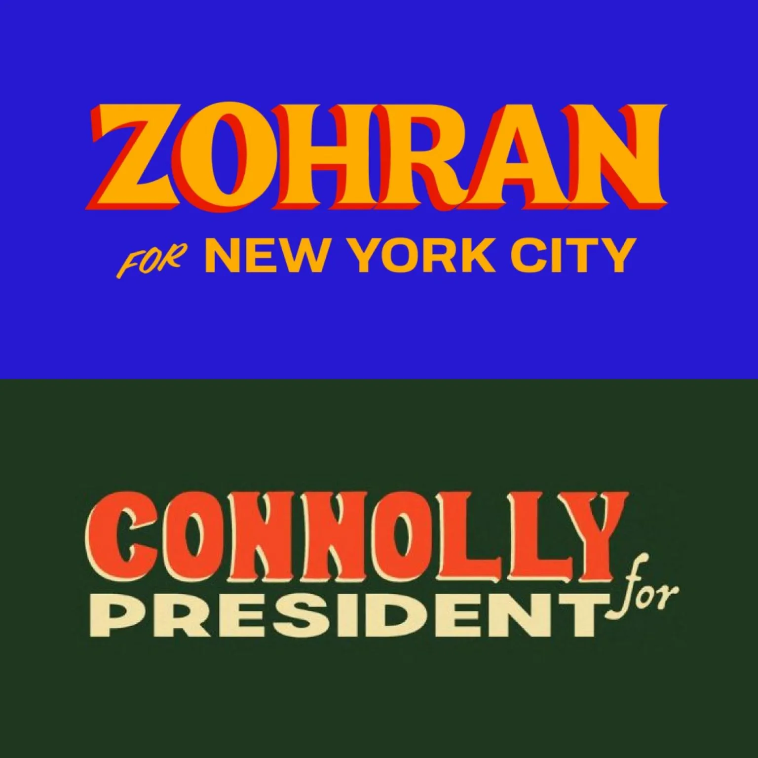
So when I saw Zohran Mamdani’s campaign branding, I immediately fell in love. The hand-drawn lettering and bold, primary colors feel like they would fit right in Hyderabad.
It’s fresh. It’s human.
I was even more delighted when I came across Catherine Connolly’s campaign design that also has a hand-drawn aesthetic: bold serif capitals, ornamental flourishes, and Irish motifs.
In an era of of AI generated art (Ghiblis), impersonal sans serif typography, and soulless ‘modern’ branding (Cracker Barrel), Zohran and Catherine’s brands feel human.
I’m hopeful that AI slop will trigger a counterreaction of good, human design.
—
P.S. Zohran's campaign branding was designed by Forge studio. Connolly's campaign branding was designed by Anna Cassidy.
P.P.S. If your article has a lazy AI generated image, I’m not reading it.
READ NEXT